
“The website looks a little dated. Let’s redesign it.” Many brand refreshes begin with that sentence.
The question is: what has become dated? Does the layout no longer work on phones? Have the products and customers changed? Or does the brand now have a more developed point of view while the website still tells a story from several years ago? Each reason calls for different design work.
Without that distinction, a project can start with a change of typeface and end as a complete reskin. The pages look new, but familiar cues have disappeared for returning customers, while the new direction remains unclear.
We find it more useful to understand a brand refresh as a set of choices: which existing associations deserve continuity, which expressions now constrain the business, and how new brand decisions will work in everyday use.
First, Identify Where the Change Has Happened
Not every website problem requires a rebrand. Blurred images, difficult typography, and an unbalanced mobile layout can be addressed through specific design and implementation work. They do not necessarily mean the positioning is wrong.
Conversely, if the brand has grown from one product into a range and customers’ needs have changed, a website organized around the old selling points needs more than a visual update. New expression requires support from the actual business and its content.
At the start of a project, separate the discussion into three levels:
- Business and audience. Who does the brand serve now? How have the products or services changed, and why does it want to be chosen? Establish the real change first, rather than using design to package a transformation that has not happened.
- Recognition and memory. Which names, wordmarks, colors, packaging, photographic habits, or ways of speaking might customers already recognize? Which are simply familiar to the team? Research and real feedback are needed; an internal vote cannot establish customer recognition.
- Digital expression. Which parts of the content structure, visual system, and interactions now obstruct the brand’s expression, and which still work? Naming specific problems helps determine the extent of the redesign.
These levels can be connected, but should not collapse into “the brand needs an upgrade.” If the team cannot explain what has changed, it becomes difficult to judge whether a proposal solves a problem or merely follows today’s aesthetic preferences.
Obys: Starting with Typography to Realign the System
In its publicly shared 2026 redesign case, Obys describes custom typography as the starting point of the new system. It also adjusts the existing logo rather than replacing it entirely. The case discusses selecting project content and aligning typography, layout, motion, and different touchpoints around shared principles. The original Obys case
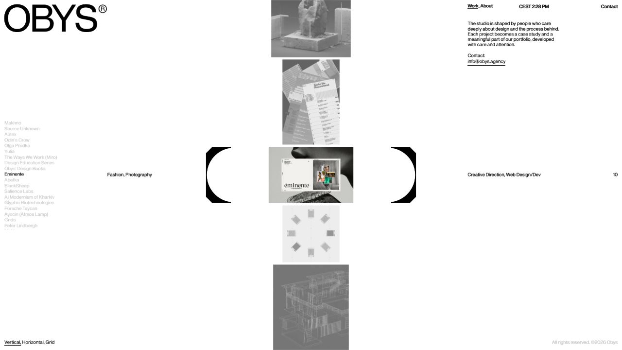
For a brand merchant, the useful lesson is to find a design decision that can organize the whole. Once typography changes, heading widths, text density, module spacing, and even image proportions need to be reconsidered together. Replacing the font file alone will rarely produce an equally coherent result.
That does not mean every refresh requires a custom typeface. Another brand may need to rebuild its photographic approach, naming system, or editorial voice. The starting point should come from its particular problem, rather than from copying a case study’s deliverables.
Our live website screenshot presents one state observed during the visit. It provides neither a before-and-after audience recognition test nor commercial performance data. This article discusses design choices; it does not claim that the redesign increased conversion by any amount.
What to Keep Depends on What It Carries
An old element can occupy two very different positions. It may be a recognizable cue for customers, or it may be decoration retained internally for years with little external recognition. “We have used it for a long time” does not provide the same reason to keep both.
Document each candidate asset alongside its uses: where it appears, how customers encounter it, whether it is consistently associated with a product or experience, and what feedback or historical material supports that relationship. When evidence is missing, mark it as unresolved rather than labeling every element a brand asset.
La Revoltosa offers another useful case. Its design team describes redrawing a historical version of the brand’s logo and carrying a distinctive voice into the website narrative. Continuity with history can happen through new expression; it need not mean preserving the old pages unchanged. The La Revoltosa design case
Design intent in a case study is not the same as validated audience recognition. For your own brand, distinguish associations supported by real customers from impressions you hope to establish in the future.
A Useful Redesign Usually Makes Three Kinds of Decision
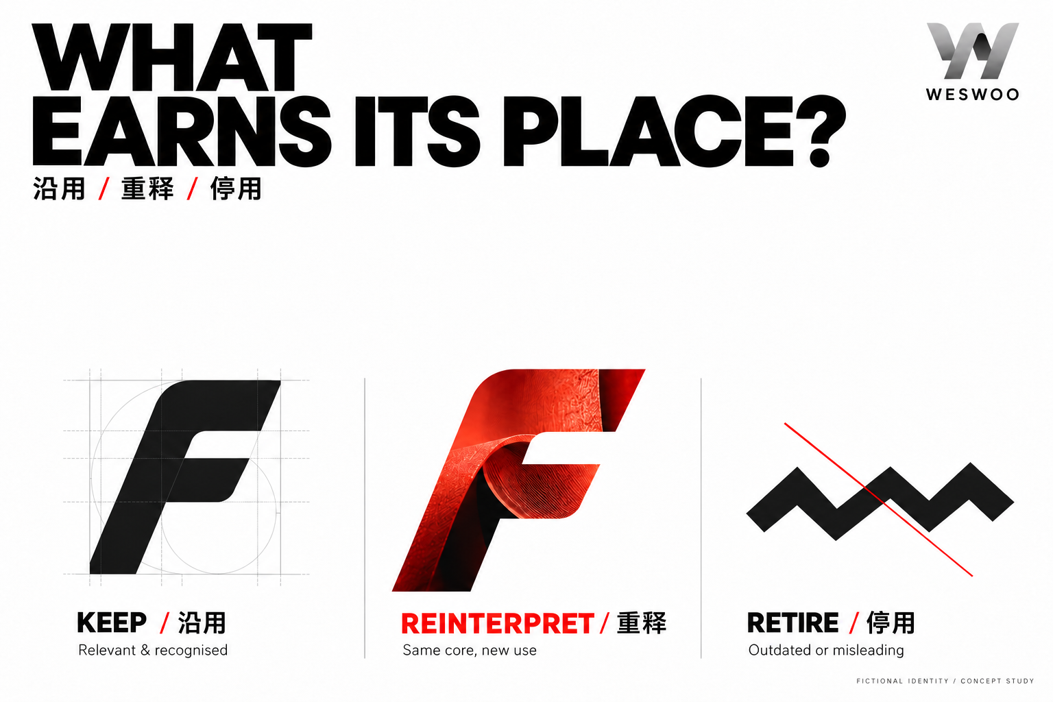
The first is to keep using an element. Parts that accurately represent the brand and still work across contexts can connect the old and new. That might be a particular feature of the wordmark or a photographic approach consistently grounded in real life.
The second is to reinterpret it. Preserve the core characteristic while changing its use. An accent color might move from covering whole screens to acting as a selective identifier; a familiar graphic might become a window for content rather than decoration. These are hypothetical design examples, not an account of an implemented brand project.
The third is to retire it. If a statement is no longer true, or a presentation repeatedly creates misunderstandings, address it directly. Visual continuity is not a reason to preserve outdated product promises or an unclear description of services.
Each decision should include its reason and scope. Keeping a color does not mean keeping every old module. Changing a typeface does not mean product naming and price hierarchy can lose their consistency at the same time. Specific boundaries help reviews move beyond “I preferred the old one” or “the new one looks more premium.”
From a Beautiful New Homepage to a Brand the Team Can Operate
A new visual direction is easiest to demonstrate with carefully selected sample content. The more revealing question is whether the team can keep using its principles when new products arrive, images are imperfect, headings become longer, and more campaigns are added.
Try it first with several pieces of real content: a featured collection, an information-heavy product, an explanation whose conditions must be clear, and an everyday campaign asset. They need not share an identical layout, but their relationship should remain recognizable.
For a Shopify store, also review product and collection organization, the theme’s content fields, existing page entry points, and whether the brand expression still works on transaction pages. In areas such as checkout, where platform and plan capabilities constrain changes, establish the actual customization scope first. Do not promise unrestricted control over the entire experience.
Brand design also affects advertising, email, packaging, and other touchpoints. These can be updated in stages, provided the transition is clearly planned. Someone arriving from a familiar advertisement should at least recognize that they are still dealing with the same brand, without customer support having to explain the redesign.
The handover should contain more than polished pages. Useful materials include the reasons for key visual choices, examples of image and copy use, the scope for variation, and responsibility for maintaining those decisions. They give the next product launch a basis and allow the design investment to accumulate value.
After the Refresh, How Can You Tell Whether It Is Clearer?
Test understanding before discussing aesthetic preference. Ask target customers to describe, in their own words, what the brand does and how it differs from alternatives, then complete a real task. Avoid first telling them that the brand wants to appear “more professional” or “younger.”
Consider returning and new customers separately. Returning customers can help reveal whether familiar cues have been lost; newcomers can show whether the new expression explains itself. Small-scale feedback is one source of judgment, not a statistically representative market finding.
Interpret business data after launch alongside changes in campaigns, channels, and products. If advertising strategy changed during the redesign, all subsequent changes cannot be attributed to design. Define the specific understanding and behavior the design aims to improve at the start of the project.
At WESWOO, the brand refresh we care about expresses the reality of the brand today while giving established value a chance to continue. The website may gain a different appearance. More importantly, the team should be able to explain why these things remain, why others changed, and what will guide the next design decision.