
When a brand is small, keeping its website coherent can feel straightforward. A limited collection, one photography direction, and a consistent way of writing may be enough to establish a clear character.
A year later, the picture changes. The spring collection feels light and airy; the winter campaign is dark and dramatic. A collaboration has its own typeface, while the next launch introduces another. Some product photographs fill the frame; others show a distant silhouette. Each release looks considered on its own, but the store begins to feel like several brands sharing an address.
Asking the team to “make all the images consistent” usually addresses only part of the problem. New products should be able to introduce something new. The more useful question is: which elements can change with a collection, and which relationships should remain familiar to customers?
A larger catalog needs clearer relationships
Imagine a home-lighting brand that begins with a few table lamps, then adds wall lights, portable lamps, and artist-designed shades. The challenge is more than finding space on the homepage. Customers now need to understand why these objects belong together, which can work in the same room, and how a new collection relates to the permanent range.
If every launch begins with an unrelated mood board, its design can become isolated from the wider brand. One collection uses architectural typography, the next uses handwritten lettering, and another introduces metallic gradients. Every decision has a reference, yet the brand accumulates little of its own.
Our view is that visual coherence communicates a standard of selection. It helps people understand how a brand approaches materials, color, everyday use, and the relationships between its products. As the assortment expands, that standard should become easier to recognize.
That changes the order of the discussion. First establish what the new collection adds; then decide how much visual change it needs. A new color, a new use case, and a collaboration with another creator do not necessarily call for the same degree of departure.
BD Barcelona: distinct objects, clear relationships
The 2022 BD Barcelona Design website shown on Awwwards is credited to Miguel Trias Works. We are examining that historical presentation, not certifying the current live site. Awwwards project entry
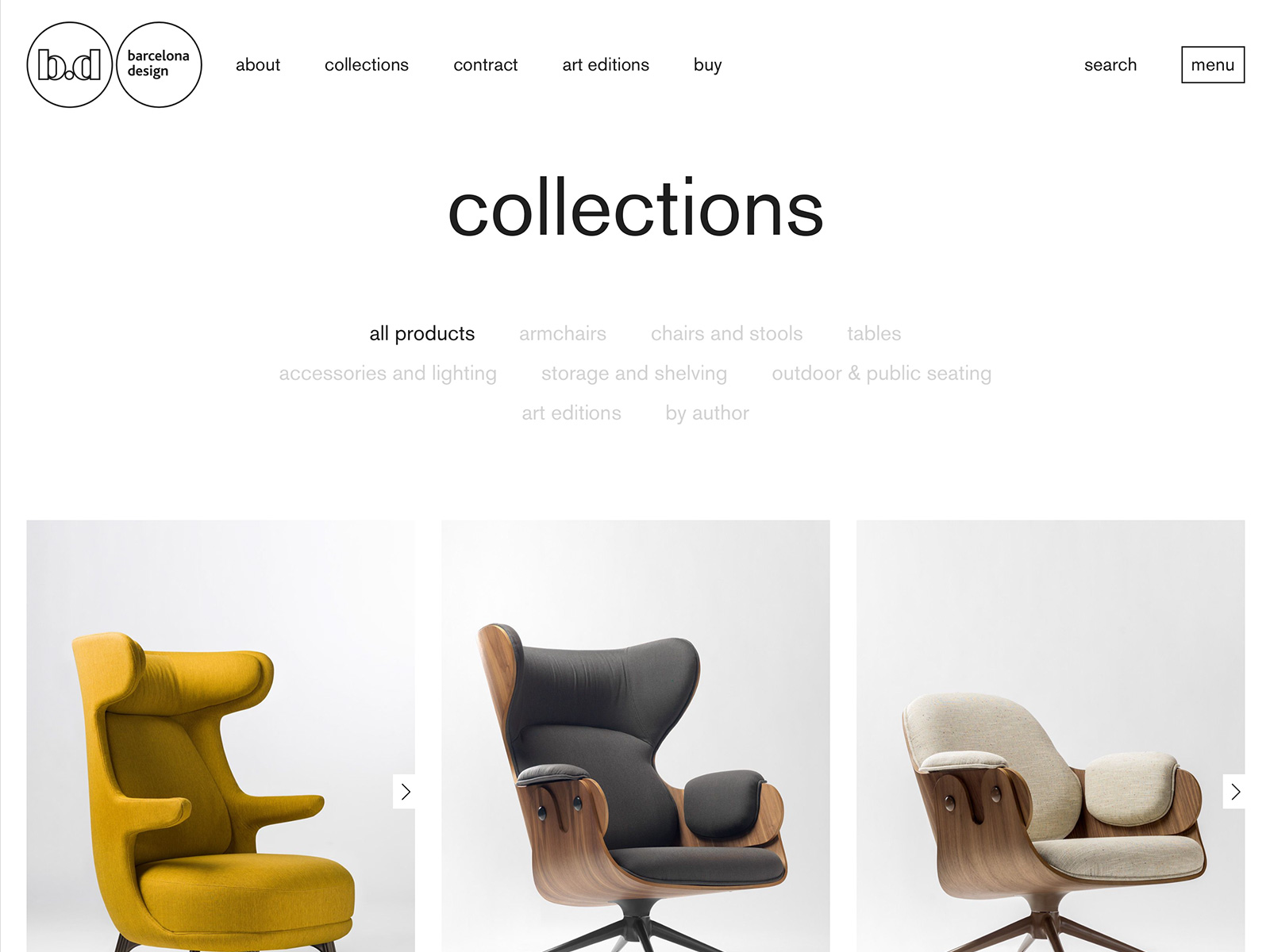
Its collection image places category and author choices above different chair designs within a common page structure. Original collection presentation
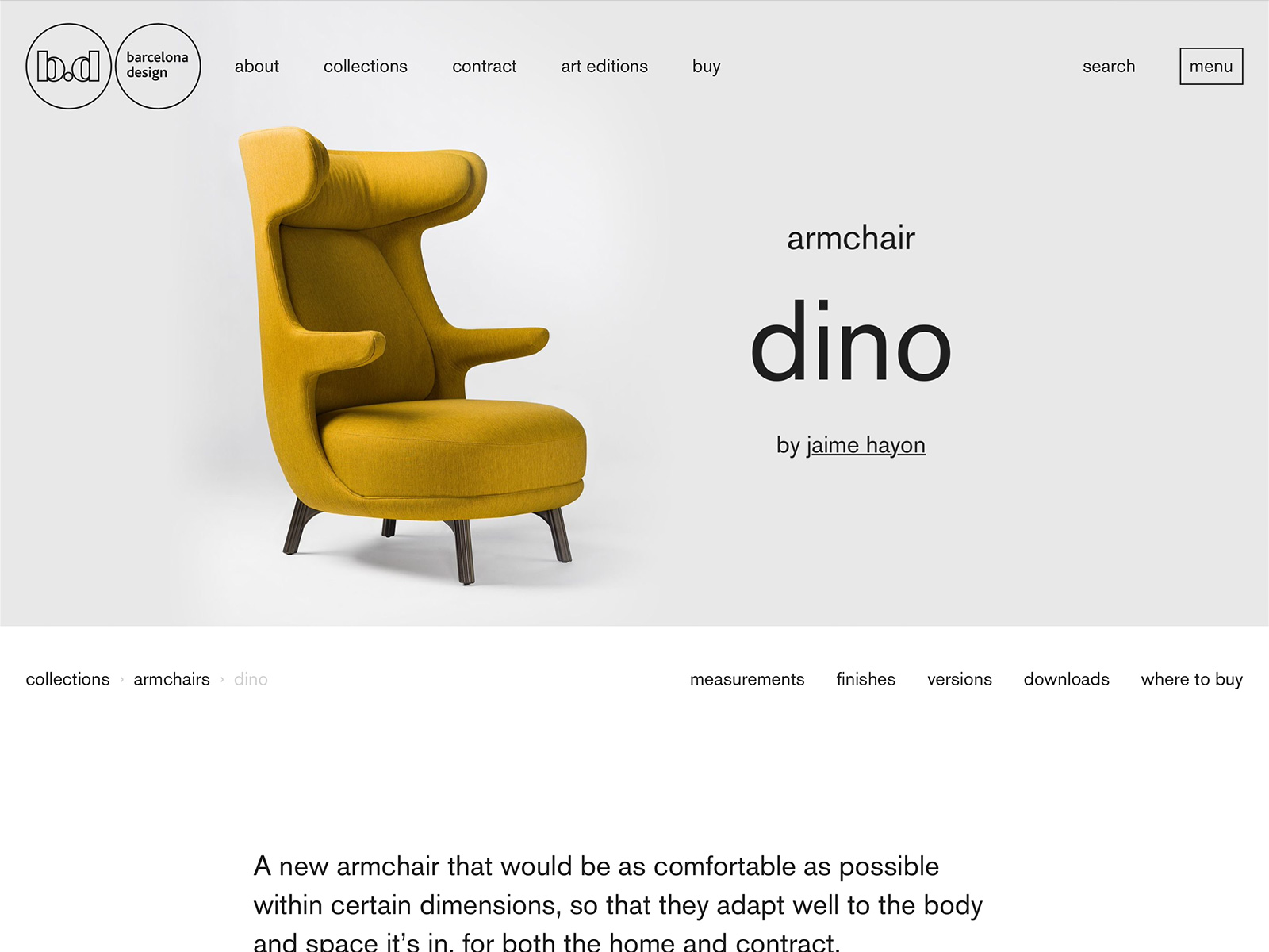
The product image separates the category armchair, the name dino and designer Jaime Hayon, with entrances to dimensions and other information. Visible labels do not establish that those functions work today.
Our interpretation is that a shared identity can reside in how people come to understand a product. They identify its type, encounter its particular character, then find the information needed to judge it. These jobs do not all need to compete within a single campaign image.
Applied to a launch, this gives a design team a more useful question: is the product changing, its relationship to a collection changing, or only its presentation? Altering all those relationships at once asks customers to learn the store again. Keeping the relationships familiar can leave more room for the objects’ differences.
That is our analysis of a presentation, not a disclosure of BD Barcelona’s internal standards. Neither the listing nor its images demonstrates a sales effect, a Shopify implementation, or a WESWOO client relationship.
Separate brand, collection, and campaign decisions
Customers do not need to know how a website’s components are organized. They should nevertheless feel that they remain within one brand, while recognizing what makes each collection different.
One way to manage this is to separate three levels of decision. These are scopes for change, rather than three prescribed layouts.
- The brand level preserves familiar relationships. This includes how the wordmark appears, how product names differ from prices, how images work with text, and how specifications can be found. Recognition and hierarchy matter more than keeping every pixel in the same position.
- The collection level permits purposeful variation. Season, material, and collaborators may change the palette, setting, camera distance, and language of a headline. Those changes should explain the collection’s character rather than simply announce a different aesthetic.
- The campaign level has an expiry date. Countdown elements, promotional colors, and launch-specific layouts may temporarily speak more loudly. They need a way to leave when the campaign ends, rather than permanently covering the brand’s regular expression.
For the hypothetical lighting brand, the everyday range might be photographed in lived-in rooms, while an artist collaboration uses stronger color and closer views of the artwork. Both can retain clear product naming, dimensions, and explanations of lighting conditions. Shopping remains understandable without giving every collection the same expression.
Conversely, putting everything on an identical white background does not automatically create coherence. A portable lamp needs to communicate movement and use; a wall light needs to explain its relationship to the wall and the surrounding space. The images may differ while the basis for understanding them remains clear.
Review products together, not only as individual posters
Brands often approve photographs one at a time, then discover that the combined screen lacks hierarchy.
Before a launch, build a realistic collection-page composition that mixes old and new products. The task is not to select the most beautiful photograph. It is to check whether equivalent information can still be compared.
If one table lamp fills almost the entire frame and another sits in a corner, a customer may mistake photographic scale for a difference in physical size. If the permanent range uses product names while a collaboration uses only evocative headlines, the listing may no longer make their relationship clear.
Image guidance should therefore identify where expression is welcome and where comparison matters. A collection cover can create atmosphere. Product cards used to compare similar items need a reasonably compatible viewing distance, an intelligible name, and the relevant differences. Unusual shapes may require exceptions, but those exceptions should be considered rather than improvised during upload.
The collection page also has a different responsibility from the homepage. It explains why these products have been brought together. The product page then explains the individual object. When those responsibilities are distinct, repeated headlines and campaign imagery are less likely to crowd out useful new information.
Make the system useful for the next launch
A guideline showing only finished screens gives an operations team limited help with the next batch of material. A useful handover also explains where decisions begin, who makes them, and how exceptions are recorded.
This does not require an extensive brand manual at the outset. Start with a short release brief: how the collection relates to the existing assortment, which brand elements stay, what can change, which assets are required, and when the campaign treatment ends. For a collaboration, check the use of partner marks and artwork against what both sides have approved.
During production, maintain product information that is independent of campaign copy. Names, materials, colors, and dimensions need traceable sources. Photography files should identify the product, version, purpose, and revision. An elegant storefront is difficult to maintain when its source material is ambiguous.
Review responsibilities also need to be explicit. The product team checks facts, design checks the relationship between collection and brand, and an editorial owner checks names and explanations. A small team may combine these roles. What matters is that “everyone looked at it” does not become “nobody owned the question.”
Finally, plan the exit. When a campaign ends, which homepage images, collection entrances, and product-card badges should disappear? If an item sells out or is discontinued, how will customers with existing orders find the information they still need? A campaign can be archived without making product identity and support information vanish with it.
Test whether a newcomer understands the relationships
People who work with a range every day can overestimate how familiar it feels to someone else. A useful review asks a person new to the brand to explain a mixed set of existing and new pages.
Ask them to find different versions of the same product, describe how the new collection differs from the regular range, and identify what makes the pages feel like one brand. If they can repeat the campaign slogan but cannot explain the products’ relationships, the expressive treatment deserves another look.
This kind of reading exercise reveals comprehension problems; it does not demonstrate a sales effect. Evaluating business impact requires actual browsing and selection behavior, customer questions, and support feedback, while considering simultaneous changes to the range, price, and inventory.
A growing brand cannot keep one color, camera angle, and layout forever. A coherent system gives change a clear place: customers can recognize what is new today while still understanding the choices the brand continues to make.