
Open a few online stores and you will see white backgrounds, large images, fine rules, and short headlines. They all look clean. Yet after you close them, some leave you with a distinct sense of character. Others leave little beyond “that looked nice.”
This is a familiar problem when a brand builds a website: the references are good and the pages contain very few elements, so why does the result still lack an identity of its own?
Our view is that minimalism makes a brand’s choices more visible. With less decoration, it becomes easier to see whether typography, imagery, content, and proportion share a common rationale. A few beautiful references can shape the appearance of a page. They do not necessarily establish how the brand should keep expressing itself over time.
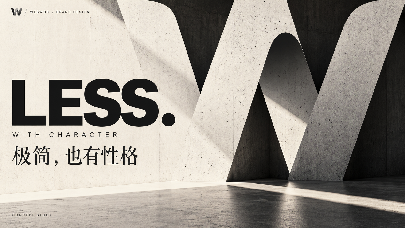
A Clean Appearance and a Clear Brand Expression Are Different Things
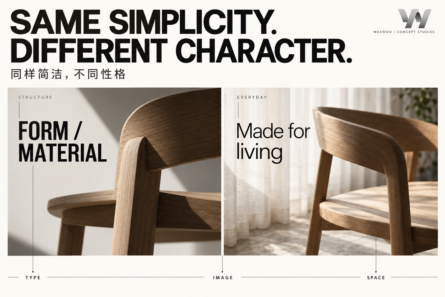
Imagine two homeware brands that both use off-white backgrounds and black text. One wants to convey durable materials and an architectural sensibility. The other focuses on the easy, approachable relationships of everyday life. Both can be visually restrained, but they should not have exactly the same photographic distance, tone of voice, or spatial rhythm.
The first might use fuller spatial relationships, defined edges, and substantial headlines to draw attention to structure. The second might retain signs of daily use, with closer viewpoints and natural descriptions that suggest someone actually lives with these objects. These are hypothetical design directions, not rules that a product category must follow.
The question is whether one choice supports the next. If the images describe a relaxed way of living but the copy reads like a technical tender, the signals pull apart. If the homepage emphasizes craftsmanship but the product page switches to glossy, futuristic materials, each page may work on its own while the overall brand impression remains unclear.
Before designing, try writing one sentence that can guide actual decisions. For example: “We want people to see the traces that materials acquire through real life.” That is more useful than “premium, international, and refined,” because it can inform photography, cropping, and copy. Each subsequent visual decision can be discussed in relation to that sentence.
A Real Example: Making the Work the Focus of the Visual System
The website project for architecture studio Telha Clarke offers a useful starting point. In the design team’s Awwwards case study, the work itself is the narrative focus. Layout and motion support the presentation of the content, rather than forcing the work into a predetermined framework of visual tricks. The design team’s case study
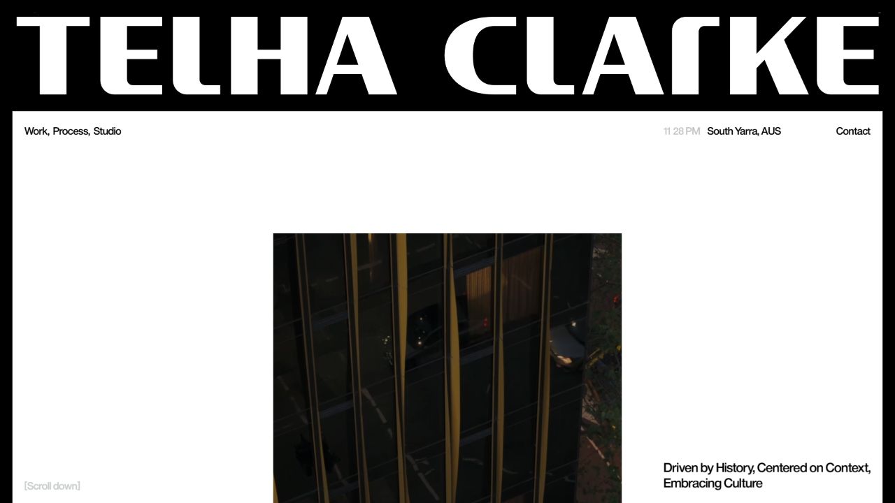
When we opened the studio’s website, the first screen combined a large brand wordmark, very restrained navigation, and an architectural image surrounded by space. Even this single frame gives us three things to discuss: the wordmark establishes identity, the empty space establishes an order of attention, and the image shows what the practice actually does. They are not all competing to be the loudest element.
For an online store, the useful lesson is to give visual assets different jobs. The brand name answers “Who is this?” Product or spatial imagery shows “What is distinctive here?” The detailed content explains “Why should I keep looking?” If every section uses a giant headline and a huge photograph, the page may look consistent while losing its points of emphasis.
We are drawing on the design method here. This is an architecture studio’s website, not a Shopify store or a WESWOO client project. Neither the case study nor the screenshot provides sales conversion data, so they cannot establish that a particular layout necessarily earns more money.
Typography, Imagery, and Space Should Express the Same Character
When a client says “the type feels wrong,” the problem is not always that the font is unattractive. The character of the typography may simply be at odds with what the brand wants to express.
Typography does more than supply letterforms. Headline length, line length, the contrast between headings and body text, and the arrangement of product codes and prices all change the viewing rhythm. A brand that wants to feel precise cannot rely on one font to carry that impression if model numbers change size from page to page and numbers and units follow unrelated styles.
When examining the design in more detail, distinguish at least these three areas:
- Typography. Define the roles of headlines, body copy, supporting information, and numbers. Check whether Chinese, English, and product names still work together. Headlines can carry personality; purchase conditions must remain clear and readable.
- Art direction. Establish a rationale for lighting, materials, settings, people, and cropping. A brand can have several photographic themes, but the team should be able to explain how they belong to the same world.
- Composition. Decide which pieces of content belong close together, where readers need a pause, and how much visual weight a product should carry. Space should help people understand relationships, rather than leaving the same large gap in every section.
These decisions need to be reviewed together. Choosing a font from a specimen, adding photographs from a library, and then asking a developer to “make the layout feel premium” usually divides a shared design judgment into several disconnected decisions.
Product photography is especially easy to underestimate. Following current trends in packaging, lighting, and backgrounds can produce a polished individual image. But if the brand emphasizes real materials and daily use, an excessively flawless image can also weaken that meaning. A beautiful photograph and an accurate expression of the brand are two things that deserve separate discussion.
A Distinctive Design Should Be Able to Grow
A designer can spend a long time refining the first screen. The more practical question is whether the brand still comes through when a new product is added, a long product name appears, or an image arrives in a different format.
A useful design system therefore needs room for variation. Portraits and close-up details can use different compositions. Short and long headlines can have different arrangements. What connects them is a comparable approach to contrast, tone, and information priorities. Consistency does not require every image to look the same.
Test the design with three pieces of content: a featured product, a product with complex information, and a real explanation that is difficult to arrange attractively. See whether the same rules can accommodate all three. If the system only works with carefully chosen short words and landscape images, it is closer to a poster exercise than a dependable way for the website to communicate.
In a Shopify project, these principles also have to reach the actual content structure. Do editors have clear guidance on image proportions? Do longer headlines wrap naturally? Can campaign pages and regular product pages share the same typographic and photographic principles? What is possible depends on the theme and the actual development scope. The approach has to work beyond the design file.
How to Tell Whether You Have Built a Brand, Rather Than Just a Style
When reviewing a proposal, set aside “Is it minimal enough?” for a moment. Ask instead: which choices make particular sense for this brand?
Temporarily covering the logo and looking at whether the typography, images, and narrative still express a shared character can help the discussion. It is not a substitute for brand recognition research with real users. It can, however, reveal whether the team has placed the entire burden of identity on the mark in the top-left corner.
A more practical exercise is to put the homepage, a product page, and one campaign asset side by side. Ask someone who was not involved in the design what each one feels like, then ask which specific details gave them that impression. Listen to their own words first. Do not build an answer into the question by asking, for example, whether it “feels premium.”
If the response goes no further than “lots of white” and “big pictures,” investigate whether the brand expression has reached the content itself. If the person mentions a material, a way of living, or an attitude toward the work, the team can begin to examine whether that is the impression it intended to build.
At WESWOO, we carry these judgments through the design and implementation of a brand’s website: first clarify how the brand wants to be understood, then translate that into typographic, photographic, and compositional principles that can be sustained. Minimalism can be an outcome, but it cannot replace that thinking. What is worth preserving is a distinctive way of expressing the brand that survives content updates and a growing product range.