
Some websites open with text, images, and backgrounds all moving at once. The first impression is striking. After a while, however, you still do not know where to focus.
Other pages use fewer effects, yet each transition feels natural. A product moves from a thumbnail into its detail view, a menu opens, or content gradually appears. The changes share a rhythm, as though the same brand were speaking throughout the website.
That sense of continuity is what makes motion design worth discussing. Movement can express a brand’s character, but it must also help people understand what just happened. One builds an impression; the other makes the website comfortable to use.
Decide How the Brand Acts Before Choosing Effects
Imagine the brand as a person handing you an object. Would the gesture be quick and direct, or gentle and unhurried? Would it suggest the weight of a material, or feel light and flexible? These questions offer a clearer starting point than searching for a beautiful scrolling animation.
The metaphor must then become a design judgment. An equipment brand that emphasizes precision might use clean state changes with a definite finish. A brand centered on soft textiles might favor gentle reveals and continuous transitions. Both are possible directions, subject to the actual content and situation.
Unhurried should not mean that every animation is slow. A brand story can allow time for observation, while a customer opening a size guide needs an immediate response. The same brand can use different levels of expression for different tasks.
Start with a small set of motion principles, including what to avoid. If the direction favors continuous reveals and soft transitions, explain when bouncing or dramatic scaling would be inappropriate. Clear principles give the team a basis for choosing individual effects.
The Lesson from fromanother: Let the Concept Guide the Whole System
In its Awwwards case study, fromanother describes light as a central visual concept. Backgrounds, text reveals, and page transitions sustain a sense of flow and diffusion. The design team also explains why different effects use different implementation methods, rather than treating technical complexity as an end in itself. The original design team’s account
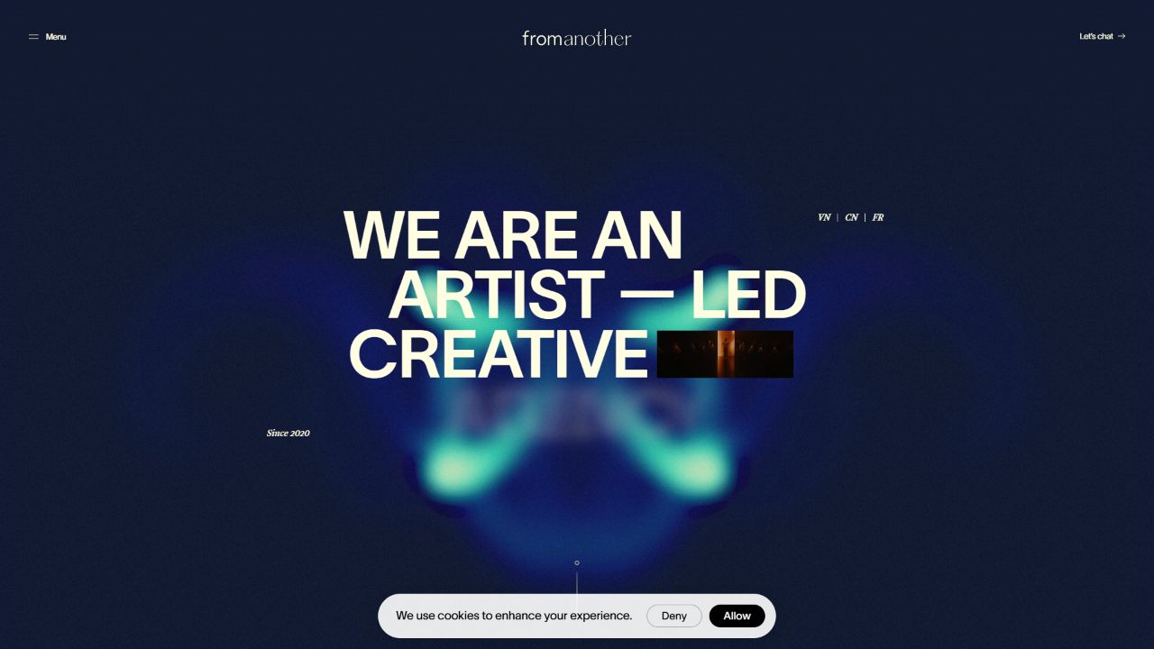
In the live website frame we observed, clear typography contrasts with softened light and color. A static screenshot preserves only one moment and cannot establish the complete rhythm of the movement. Our account of the motion concept comes from the team’s published explanation; the screenshot is not evidence of full playback or performance testing.
For an independent brand’s website, the more useful lesson is the relationship between concept and constraints. When one idea guides how things appear, change, and finish, a website can develop its own grammar. Borrowing separate animations from several award-winning websites does not necessarily create that coherence.
This project should not be treated as a ready-made implementation template for an online store. A portfolio website has more freedom to explore. Shopping also involves variants, prices, quantities, and order states. Brand motion must adapt to those tasks, rather than asking the tasks to accommodate a performance.
Three Kinds of Motion, with Three Different Responsibilities
Separate motion by its job before discussing individual effects. This preserves room for brand expression without making every button responsible for telling a story.
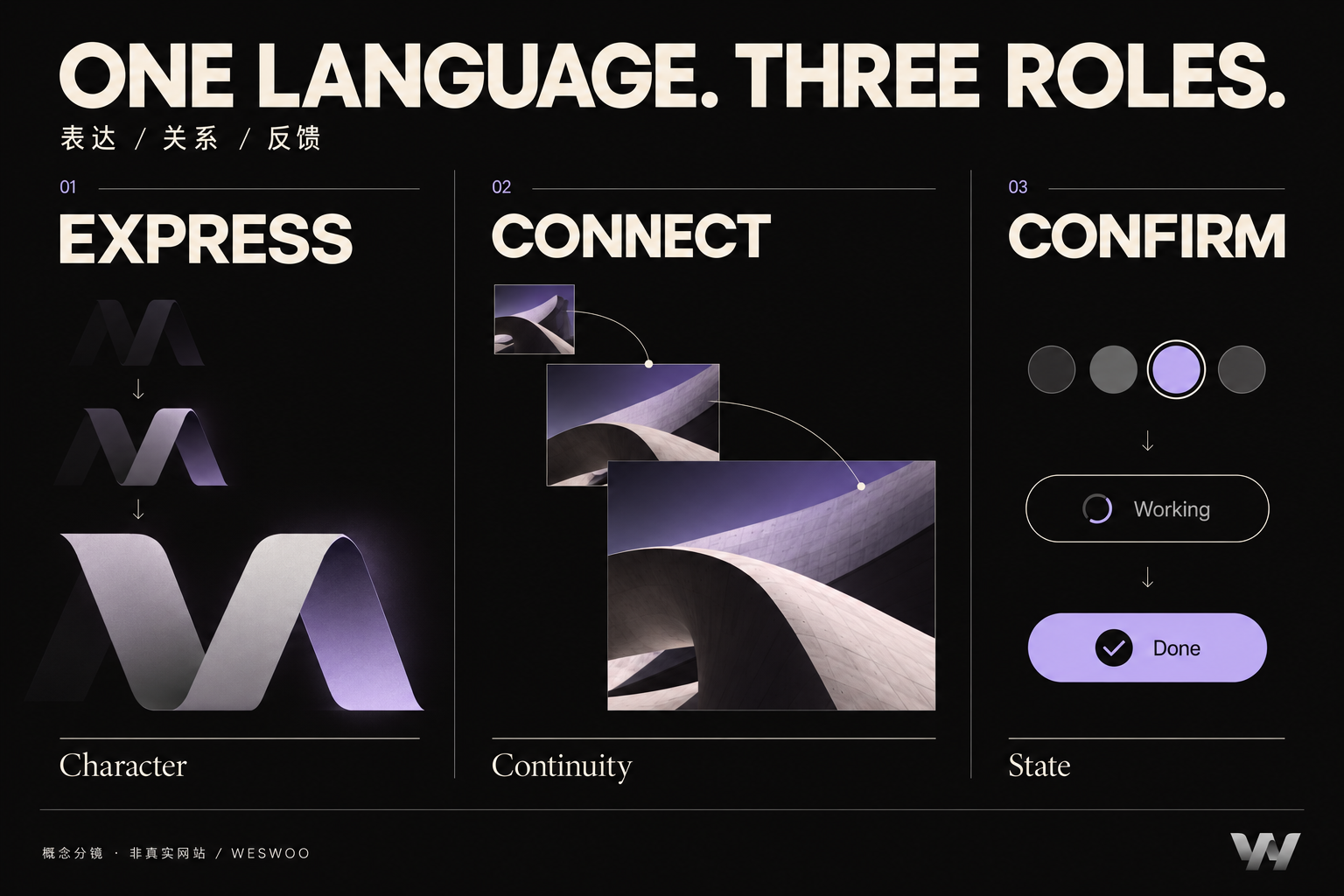
- Expressing character. Brand films, hero visuals, and editorial narratives can establish an atmosphere. They should offer something worth watching while letting people continue reading, rather than making a period of waiting the price of entry.
- Explaining relationships. Opening an image in detail, expanding a menu, or switching content groups can use continuity to clarify position and hierarchy. The movement should make it easier to understand where something went.
- Reporting results. Selecting a variant, submitting a form, or adding an item to the cart needs prompt, intelligible feedback. An operation in progress must look different from a confirmed success. A completion animation cannot stand in for a result that is still unknown.
These distinctions help answer a common question: why can the homepage be expressive while the purchase area remains restrained? The person’s attention has shifted from experiencing the brand to completing a specific task.
Consider a product color selector. The photograph can transition gently, but the color name, selected marker, and price must accurately reflect the current option. If someone switches repeatedly, an earlier animation must not bring the old image back over the latest selection. Otherwise, smooth movement can make an incorrect relationship harder to notice.
The professional work often lies in less conspicuous states: a request is unfinished, an image has not loaded, someone returns midway, or a new action interrupts an earlier one. A recording in which the pointer follows one predetermined path is not enough to establish that the real experience works.
What a Language of Motion Needs to Specify
“Make it feel like this reference” leaves too much open to interpretation. Break the direction into concrete questions: which elements move, what the movement means, where it begins, how it accelerates and settles, what appears first, and when an action may be interrupted.
There is no need to begin with a thick specification. Choose three important situations: entering a brand page, moving from a list into specific content, and completing an important action. Prototype them using the same motion principles, then ask whether they feel like parts of one system.
Duration and distance need to be considered together. A small icon changing slightly and a full-screen image moving across the page have very different effects on the viewer. No set of millisecond values automatically suits every brand and device. A fixed duration cannot replace observation and usability checks.
The prototype should also show how the content works without those movements. If hierarchy remains clear through layout and state text after translation effects are removed, the information has its own structure. If a heading never appears when the animation stops, the information has become dependent on the effect.
Good Judgment Includes Letting People See Less Motion
Large scaling effects, panning, or parallax can cause discomfort for some people. Reducing movement is a more appropriate experience for those users, rather than a compromise in brand expression.
In W3C’s WCAG 2.2, criterion 2.3.3, Animation from Interactions, is Level AAA and addresses disabling non-essential motion animation. Criterion 2.2.2, Pause, Stop, Hide, is Level A and requires controls for qualifying moving information that starts automatically, lasts more than five seconds, and appears alongside other content. Their conditions differ; they do not mean that every animation lasting over five seconds is a violation. Interaction animation guidance and automatically moving content guidance.
An implementation can respond to the system’s prefers-reduced-motion preference by reducing or replacing non-essential movement while preserving the selected item, operation results, and reading order. Simply setting every duration to zero still requires checks for event handling, content visibility, and state synchronization. MDN documentation.
Review the experience beyond the designer’s computer. On real phones, switch options, go back, and repeat actions; use a keyboard to check important entry points. Record when content becomes visible and when an action receives a response. These are design and engineering acceptance methods, not a claim that these checks alone demonstrate complete conformance to a standard.
At WESWOO, we want motion on an independent store to have a basis in both the brand and the actual state of the interface. It can feel fresh to someone encountering the brand for the first time while remaining easy for someone returning to buy again. That is when motion becomes more than a demonstration: it becomes a lasting way for the brand to express itself.