
·
A customer arriving at a Shopify store encounters typography, photography, color, and composition. As they start shopping, their attention moves toward product differences, sizing, prices, delivery, payment, and support. Both experiences shape their judgment of the brand.
A photograph of a backpack can create interest. The customer still needs to understand whether their laptop fits, how the bag looks when carried, what its material feels like, which colors are available, and whether it can reach their address. The store should answer these questions through a coherent visual language.
Brand aesthetics become commercially useful when brand expression, product evidence, and purchase actions work together.
Moving from Figma to Shopify therefore means delivering a design system that can accommodate real merchandise, changing content, different devices, and everyday operations. It should help customers recognize the brand, understand its products, and make decisions. It should also help the merchant maintain that identity after launch.
The backpack examples below are hypothetical design scenarios. They illustrate decisions a team might make, rather than describing a WESWOO client or claiming a measured outcome.
1. Define What the Brand Should Communicate Before Choosing Its Appearance
Requests such as “make it premium” or “give it an international feel” express an ambition. They leave many practical decisions unresolved.
Premium might mean restrained typography, detailed product photography, a confident editorial voice, or exceptional clarity around craftsmanship. An international experience might require multiple languages and market-specific information. Different team members can interpret the same request differently, turning reviews into repeated disagreements about colors and pictures.
Start by answering three questions:
- Who is the product for, and what value does it offer? Consider function, style, durability, convenience, and the situation in which someone will use it.
- What evidence does the customer need? Materials, construction, dimensions, use scenarios, and service commitments play different roles in a purchase decision.
- How should the brand be remembered? Decide which qualities should consistently appear in its language, imagery, layout, and interaction.
Imagine a backpack brand positioned around dependable equipment for urban life. Its photography might show commuting and everyday carrying. Detail images should explain organization, fabric, and construction. Product information should be easy to locate, and interactions should give clear, stable feedback. Reliability becomes something the customer can inspect and experience.
A fashion-led brand might need stronger image composition, collection storytelling, and styling references. Customers reaching its product pages would still need understandable dimensions, materials, and purchase information. The brand character influences how this information is presented.
Document the agreed direction with concrete examples: preferred image treatments, appropriate writing, useful product evidence, and the role of each page. This gives design and development a shared basis for decisions.
Aesthetic direction should fit the brand positioning, the merchandise, and the way customers evaluate it. The same minimalist layout can communicate confidence for one store and leave another store’s products insufficiently explained.
2. Turn Aesthetic Choices Into Rules That Survive Across Pages
Recognition develops through recurring choices: the way a brand photographs products, arranges titles, distributes color, groups information, and controls reading rhythm. Figma should make these choices explicit and reusable.
Typography needs both character and reading hierarchy
A display heading can carry a distinctive personality. Product names must accommodate different lengths. Body copy needs to support sustained reading, while prices and specifications need consistent emphasis.
Test these roles with real content. A short sample name may look elegant, while a longer production name pushes the price and purchase control into unexpected positions. A striking display typeface may be difficult to read in a dense size guide.
Consider target languages, font licensing, and web delivery during selection. A translated page should preserve the intended information hierarchy even when the wording expands. Specify when text can wrap, how headings scale, and which styles serve supporting information.
Give colors stable jobs
Define colors for brand expression, body text, secondary information, primary actions, and status feedback. A customer should recognize the main purchase action and distinguish selected, unavailable, error, and success states.
Shopify’s color guidance connects branding with hierarchy and accessible contrast. This provides a useful foundation for deciding how color should function across a theme. Shopify color system guidance
For a project, the practical deliverable is a set of named roles that designers and developers can apply consistently. Color choices should continue to make sense when a campaign background changes or a component appears on another page.
Set density according to the task
Space helps customers understand relationships. A brand story may benefit from a slower reading rhythm. A collection page needs enough information for comparison. A purchase area should keep the relevant price, options, availability, and action closely connected.
Applying one spacing pattern everywhere can leave comparison pages sparse or product details scattered. Define how expressive content, comparison, and action each use space.
These rules make future additions easier to judge. A new product launch can introduce fresh photography and copy while still belonging visibly to the same store. The design system becomes a reference for everyday decisions.
3. Design Along the Shopping Journey, With a Clear Job for Every Page
Customers arrive through advertising, search, social media, and shared links. Many first encounter the brand on a product page. Brand identity needs to remain coherent wherever the visit begins.
Landing pages should continue the promise that brought the visitor in
If an advertisement features lightweight commuting, the destination should quickly explain how the product supports that use: carrying method, weight, storage, laptop compatibility, and daily practicality.
The image treatment can continue the advertisement’s style, while the content supplies further evidence. Changes in product imagery or positioning can force the visitor to reconstruct why they clicked. Agree on the entry promise, the first question the page answers, and the next useful action.
This is a joint content and design decision. A visually impressive hero needs enough context to connect its atmosphere with a relevant product choice.
Collection pages should support meaningful comparison
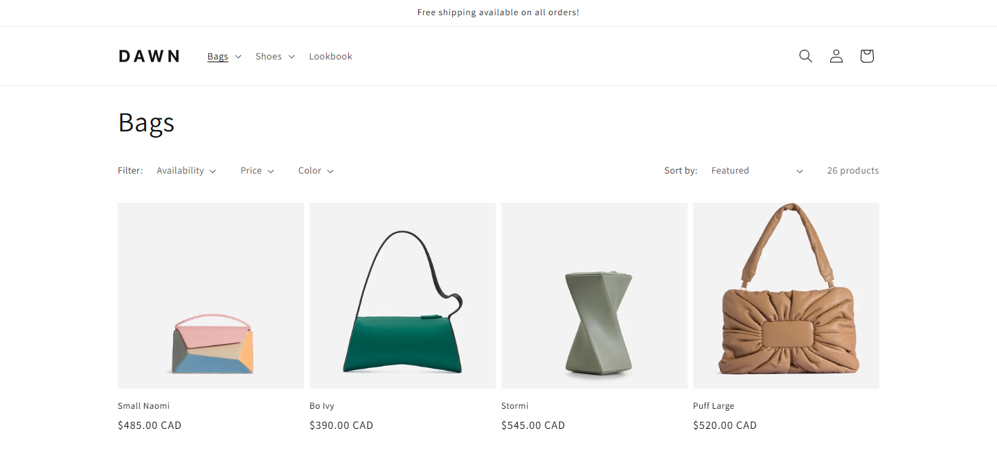
For backpacks, capacity and intended use may be more useful than another brand statement. Product cards need a stable reading order for image, name, price, and relevant attributes. Filters should reflect differences customers actually use when choosing.
A collection becomes visually fragmented when image treatments vary widely, product names spill unpredictably, and every card gains another badge. Define which attributes deserve a place in the grid and which belong on the product page.
Product pages should connect attraction with evidence
A customer may first respond to a bag’s appearance, then inspect carrying proportions and interior organization, and finally confirm color, price, and delivery. Arrange content to support that sequence.
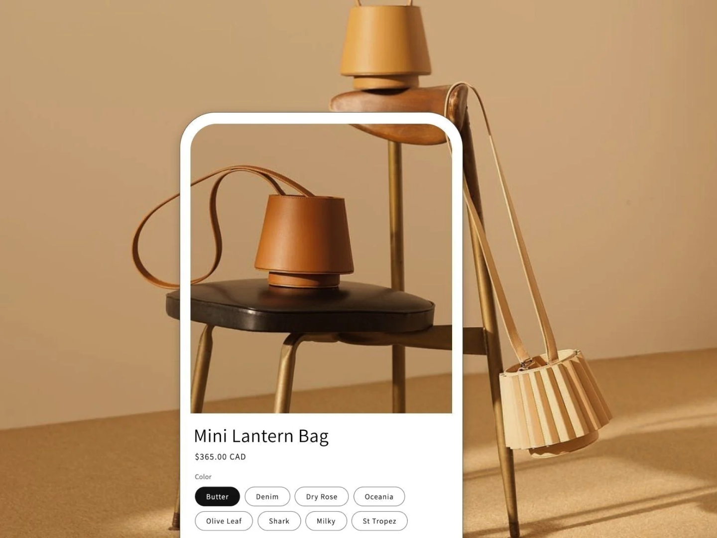
The main image establishes the product impression. Detail photography explains construction. Use photographs show context, while scale references help someone judge size. The purchase area should clearly associate the selected variant with its price, availability, and action.
Changing a color should reveal the corresponding product information and images where available. Unavailable choices need a clear explanation and an appropriate next step. Small inconsistencies here can make the merchandise harder to understand, even when the overall page looks refined.
Cart and checkout should help customers confirm their decision
At the cart stage, attention narrows toward the chosen item, variant, quantity, costs, and discounts. Preserve the brand’s visual language while making those checks easy.
Recommendations and promotional content need a considered place in that sequence. A cart should give users a clear route to edit their selection and understand what happens next.
After purchase, customers should know where to find their order, how delivery updates will arrive, and how to obtain support. The complete shopping experience extends through these moments. Consistent design helps the store feel like one organized service throughout.
4. Use Figma to Describe Real Content and Interaction States
Design files often show an ideal moment: a short title, available inventory, a finished image load, and a selected option. A live storefront also handles long names, different currencies, missing images, waiting states, unavailable options, and failed actions.
Include those conditions in the design scope.
For a purchase control, discuss the states in which a customer can buy, still needs to select an option, is waiting for an add-to-cart request, encounters unavailable inventory, or receives an error. Each state needs understandable wording, visible feedback, and a usable next action.
Product cards should be tested with short and long names, regular and promotional prices, and different option counts. Explain what can wrap, what can be shortened, and how added information changes the layout. Empty content also needs a decision: should a missing secondary image disappear, or should the component retain its space?
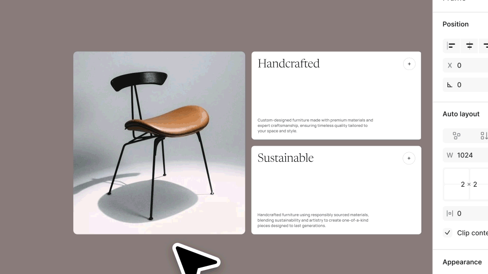
Figma Auto Layout helps frames respond to content changes, while Variants organize related component states. These tools can make the intended behavior clearer. The development team must still implement and test that behavior in a browser. Figma Auto Layout guide, Figma Variants guide
Mobile deserves its own information decisions. A desktop product page may place imagery and buying information side by side. A phone requires an ordered sequence: which facts appear first, how images are cropped, where options are selected, and whether floating elements obscure controls.
Use actual merchandise and translated content while testing that sequence. Customers should retain access to the evidence they need without losing their place in the purchase process.
Developers should participate before handoff. Together, the team can identify which data controls a state, which behavior comes from the theme or an app, and which information changes by market. Resolve these relationships while the design is still easy to revise.
A useful Figma deliverable explains how the experience behaves as its content and state change. That explanation carries design intent into implementation.
5. Plan Images Around the Questions They Help Customers Answer
Photography strongly influences a store’s appearance. Its usefulness depends on what each image contributes to understanding the product.
A practical asset plan gives different images distinct responsibilities:
- Brand and context images show the environments, activities, or visual world associated with the merchandise.
- Product views make form, color, and structure visible.
- Detail images explain materials, joints, finishes, and construction.
- Scale and use images help customers judge dimensions, capacity, and practical relationships.
- Explanatory diagrams clarify features that a photograph cannot easily communicate.
For a backpack, front-facing product images leave capacity and internal organization partly unexplained. Carrying views, opening details, and storage demonstrations provide additional evidence. Decide which questions matter before commissioning a large image set.
Keep photography direction consistent while preserving accurate product information. Lighting, framing, and editing should make the product legible. Retouching needs to respect its actual color, texture, and construction.
Plan assets for their placement and device. A wide desktop banner and a narrow mobile viewport may need different compositions. Establish subject placement, cropping, and safe areas for accompanying text. Prepare alternate assets where one source image cannot serve both layouts well.
The handoff should explain what to shoot, where each asset belongs, how replacements should be prepared, and what descriptive text is needed. This gives the operating team a repeatable process for the next product launch. It also prevents a carefully art-directed store from gradually accumulating incompatible imagery.
6. Map Figma Components to Maintainable Shopify Structures
Figma components need an explicit relationship with Shopify pages, product data, and merchant editing.
For a brand story module, define who maintains the text and images and which arrangements are supported. For a product card, define where the name, price, image, and labels come from. For a buying area, connect the visual states to real variant selection and availability. For campaigns, decide which layouts can be reused and which content requires separate configuration.
Shopify themes organize pages through structures including templates, sections, and blocks. Configurable modules can support merchant editing; the theme implementation determines which controls are available. Shopify theme architecture
The project should preserve brand expression while giving the operating team practical control. Typography roles, image proportions, information hierarchy, and interaction logic need stable implementations. Images, copy, featured merchandise, and campaign content need straightforward maintenance.
An effective editing model has three layers:
- Shared brand rules: Maintain a consistent heading hierarchy, color roles, and action patterns.
- Editable business content: Let the team update relevant text, media, and product selections.
- Layout constraints: Explain acceptable image proportions, text lengths, and module combinations.
For example, a campaign hero can offer separate desktop and mobile images, a heading, supporting text, and an action. Its controls should explain how those inputs behave. Unlimited alignment and styling options can make future changes difficult to judge; carefully chosen settings can make useful updates easier.
WESWOO’s brand design and Shopify development work can connect the visual guidelines, Figma components, and theme editing model at this point. The handoff should show merchants what they can change, how to do it, and which checks to make afterward.
The result is a store whose identity can survive routine merchandising. Maintainability is part of the design outcome because new content will keep arriving long after launch.
7. Include Loading, Responsiveness, and Accessibility in Design Acceptance
A customer’s impression also comes from how the store runs. Large imagery needs to appear promptly. Actions need visible feedback. Text needs to remain readable. Dismissing a dialog should return the customer to a usable context.
Performance begins with choices about content and behavior
During review, give each video, font, animation, and large image a clear purpose. What does the homepage video communicate? Which font weights are actually used? How does an animation explain a transition? Which content needs priority on mobile?
Development review should then inspect real pages and the effects of imagery, loading behavior, scripts, and apps. Test the home, collection, product, and cart experiences separately. Shopify’s performance guidance provides a technical foundation for this work. Shopify theme performance guidance
A useful review records the visible symptom as well as the underlying issue. For example, a product image arriving late and a purchase control reacting slowly are different problems. Both matter to the shopping experience, and each needs a specific corrective action.
Accessibility belongs in the visual system
Check text contrast, clear control names, visible keyboard focus, and understandable errors. A color choice should also have a readable label. Motion should accommodate users who prefer less animation, and image descriptions should reflect the image’s purpose.
Shopify includes accessibility in its theme guidance. These considerations should enter component design and browser testing together. Shopify theme accessibility guidance
Review the interaction as a complete task. Can someone reach the option selector, understand its state, add the item, and continue after an error? A visually consistent component still needs to behave clearly within that sequence.
A mature brand experience integrates expression, reading, and operation. Performance and accessibility are part of what customers actually encounter.
8. Confirm Shopify Checkout Capabilities Before Designing the Final Steps
Cart and checkout belong to one customer journey, but their customization boundaries differ.
The theme can support a project-specific cart experience. Shopify Checkout has its own branding and extension capabilities, affected by the store’s plan and configuration. Standard branding includes elements such as the logo, colors, and fonts; advanced customization has additional eligibility requirements, including Shopify Plus for certain features. Shopify checkout customization guidance
Confirm these boundaries during Figma design. Identify what existing settings can achieve, what requires an extension, and what is available to the actual store. This allows the team to produce an implementable design and an accurate scope.
Brand continuity at checkout can come from familiar typography, colors, and logo treatment. It also comes from clear cost information, recognizable merchandise, and an understandable next step.
For multiple markets, verify the real presentation of prices, currencies, delivery information, and product availability. The visual design should accurately reflect the transaction the customer can complete.
Include thank-you and order-status experiences in the discussion where relevant. Customers need confirmation and a route to further information after paying. A complete design brief accounts for these moments within the platform’s supported capabilities.
9. Accept the Store Through Visual, Customer, Business, and Editorial Checks
Comparing browser screenshots with Figma is useful, but delivery acceptance needs a wider view.
Brand and visual consistency
Check typography, color, image cropping, content density, and hierarchy. Confirm that the important design intentions survive implementation and that the different pages remain recognizable as one brand. Record where responsive behavior deliberately changes the composition.
Reading and operation
Ask test users to complete specific tasks: find a suitable product, compare options, understand delivery, change the cart, and complete a test purchase. Watch where they hesitate, return to earlier content, or ask questions. Their ability to understand the store provides concrete evidence for refinement.
Real commercial states
Cover available and unavailable products, promotions, multiple variants, and different markets. Include waiting, failure, and recovery states. The store should remain understandable as these conditions change, and the visual feedback should agree with the actual business state.
Day-to-day editing
Have the operating team replace an image, edit a long title, update campaign copy, and adjust a supported module. Check whether the store retains its hierarchy and visual rhythm afterward. This tests whether the editing model is practical and whether the design can continue to serve the business.
After launch, evaluate different outcomes separately. Brand recognition, information comprehension, successful task completion, and purchases answer different questions. Orders also depend on traffic, merchandise, price, inventory, delivery, and promotions.
Use specific hypotheses when assessing a design change. For example: “Does adding capacity imagery help customers choose the appropriate backpack?” Observe task completion and questions, then examine relevant behavior and order data. If using a comparison experiment, document the traffic and merchandising conditions that might affect its interpretation.
This approach creates an evidence-based discussion of design quality without promising that a visual change alone will produce a particular sales result. It also helps the team prioritize the next improvement.
10. Connect Brand Design, Shopify Development, and Operational Handoff
For WESWOO, this kind of project can follow one connected delivery path: establish the brand direction and customer decisions, develop the visual system and shopping flows in Figma, implement them with real Shopify content, then verify the experience across devices, markets, purchasing tasks, and merchant editing.
Each stage should leave something the next stage can use. Brand work provides expression principles and asset requirements. Design provides components, states, responsive rules, and content structure. Development provides maintainable modules and an editing guide. Acceptance provides test paths, issue records, and verified corrections.
The scope should follow the store’s actual situation. An existing theme may need focused visual and component improvements. A brand refresh may require a broader review of product presentation and page structure. Design and development can assess these needs together before choosing an implementation approach.
This is how WESWOO’s brand design and Shopify development can support the subject of this article: by connecting visual identity with merchandise, implementation, and the team’s ability to operate the finished store.
Brand aesthetics ultimately reach the customer through every act of understanding, choosing, and purchasing.
When imagery supplies credible product evidence, typography establishes a clear reading order, components adapt to real content, and interactions provide stable feedback, design becomes a useful part of the shopping experience. When the operating team can preserve those qualities through future updates, it becomes a lasting brand asset.

WESWOO — Shopify Storefront Development
We help Chinese brands expand internationally with storefront development and Shopify Plus integration services, supporting their cross-border commerce operations.
- Shopify storefront branding
- International UI design
- Multichannel social media marketing