
A Shopify store selling high-value products needs to do more than look premium. Buyers comparing equipment or considering a business purchase need to understand what is being offered, find supporting evidence and know what to do next. A large company introduction does not necessarily answer those questions. Neither does a product grid covered in sale badges.
The Volenta website and brand identity project by SquidX Agency and Saber Ali, published on Behance, is a useful reference. Its visual identity combines a dark hero section with pale content areas, deep-green panels and bright lime accents. More importantly, the project demonstrates how services, results, customer stories and contact actions are arranged throughout the visitor journey.
This is a design case study followed by a Shopify implementation proposal. The project’s public presentation does not establish that Volenta runs on Shopify. The screenshots and animated numbers are design material, not independently verified business results. The accompanying Section code has not been deployed or tested in a production store.
1. Give the accent colour a specific job
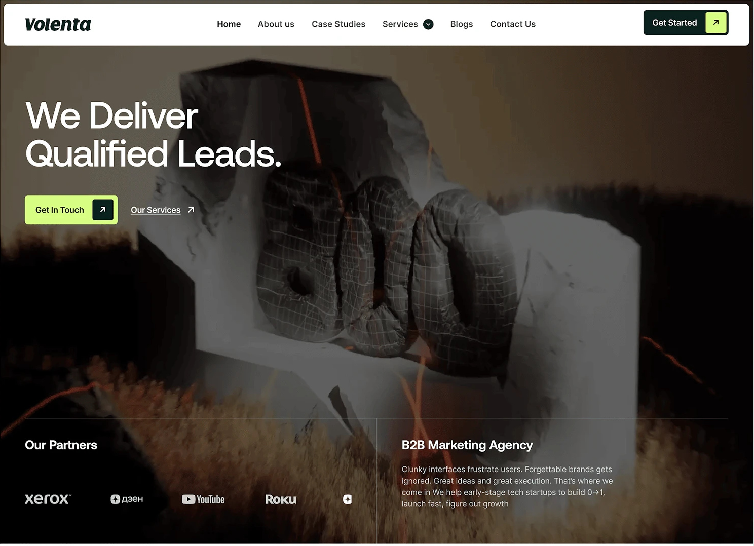
The hero uses a dark image, white type and a bright contact button. The navigation repeats that action through Get Started. Further down, a highlighted service card stands beside darker alternatives. The eye can recognise an action without every component competing for attention.
When building the Shopify theme, define separate colours for backgrounds, card surfaces, text, borders and actions. The example below uses a near-black base, deep-green cards, a pale mint surface and a lime accent. These design tokens take inspiration from the Volenta project; they are not intended to represent an extracted or official brand specification.
Choose the main action according to the transaction. An available standard product can lead to Add to cart. An order that needs configuration or a quotation should explain what information the buyer needs to provide. Price alone cannot decide this: a costly standard product may still be directly purchasable, while an inexpensive custom part may need confirmation.
The practical check is to look at the page with its normal content and imagery. Can a visitor identify the primary action? Does secondary navigation remain available without looking equally urgent? There is no universal percentage of lime that guarantees a successful design.
2. Make the page easy to scan before adding more decoration
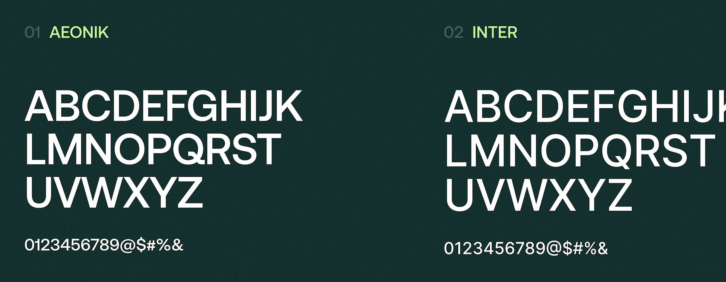
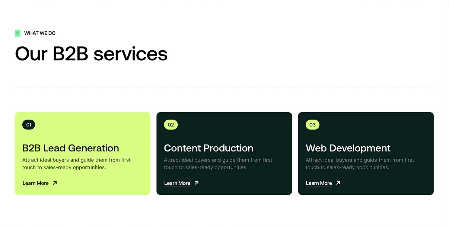
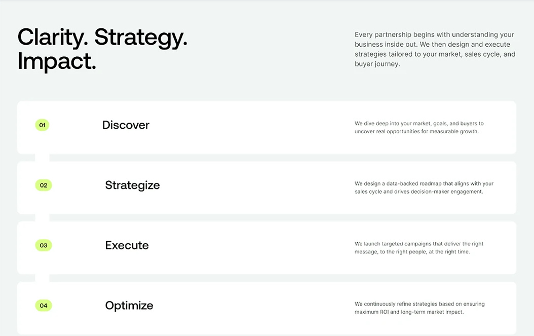
The case presentation identifies Aeonik and Inter as its font pairing. Section labels, compact symbols, numbered service cards and a consistent arrow treatment give the visitor repeated landmarks. The service screenshot shows the highlighted first card beside Content Production and Web Development. The process page presents Discover, Strategize, Execute and Optimize in sequence.
In a theme, implement these as reusable components. A section label, heading, introduction and list of blocks should each have their own role. Do not make an entire paragraph look like a section title just to create emphasis. Before adding a commercial font, check its webfont licence and loading strategy; naming it in CSS does not make the font available.
Number a sequence when the order matters. For product features that can be read independently, a meaningful label may work better than forcing them into four steps. On mobile, preserve the relationship between the number, title and explanation, and avoid a layout that depends on hovering to reveal essential content.
3. Build an evidence matrix, not a wall of unsupported numbers
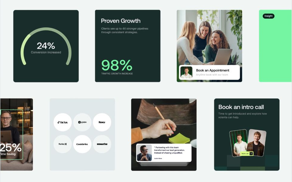
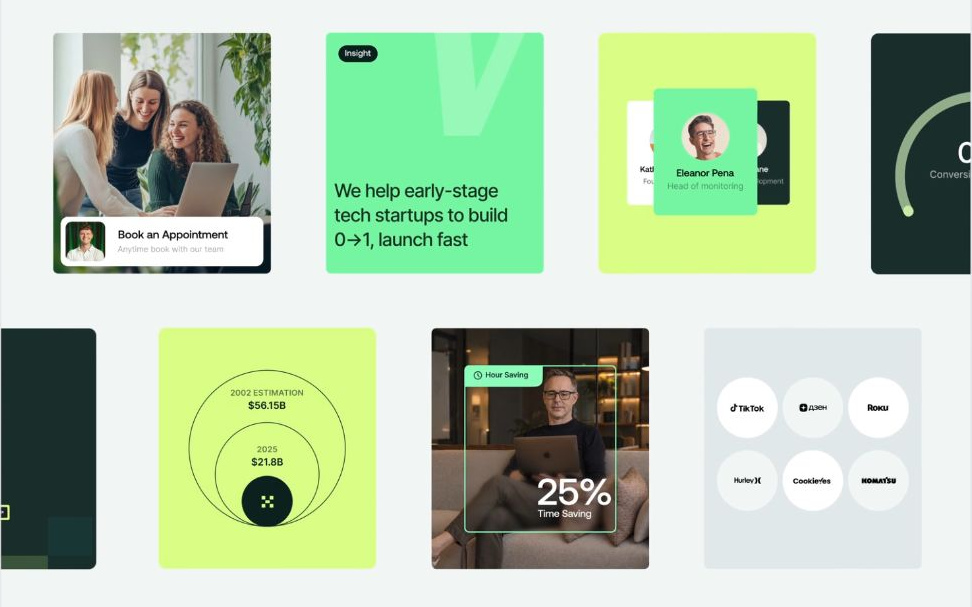
The project’s moving card composition combines metrics, a gauge, people, time-saving visuals, a scale comparison and appointment actions. Different frames show different values as the animation runs. Those values should be discussed as interface content, not repeated as audited performance claims.
The original seven-part comparison is retained below. The Shopify column describes possible content types. It is not a specification for any particular product: certifications, delivery times, warranties and improvements require evidence for the actual item and market.
| Card type | What the case presentation displays | Possible Shopify equivalent |
|---|---|---|
| Large growth metric | A large traffic-growth percentage with a short definition; the number changes during the animation | A measured performance difference, with the product version, baseline and test conditions beside it |
| Gauge | A curved progress indicator and conversion text on a dark-green card | A properly defined operating range or measured parameter; do not turn a categorical certification into a misleading percentage |
| Person or testimonial card | Brightly coloured person cards, names and roles | An attributable customer or reviewer statement, used with appropriate permission and context |
| Time-saving card | A workplace photograph, Hour Saving label and animated time-saving percentage | An actual installation or delivery measure, stating where and when it applies |
| Circular comparison | Nested circles labelled with two years and monetary values | A clearly scaled comparison of footprint or running cost, including units and the source of the comparison |
| Insight card | A short statement including “launch fast” | A specific product or service condition; any certification or warranty must match supporting documentation |
| Appointment card | Team portraits and Book an intro call | A contact action that explains what the discussion covers and carries the selected product or configuration into the next step |
What matters is that every claim comes with enough context to explain it. A figure such as “40%” means very little on its own. The markup should keep the metric name, relevant product, baseline and applicable conditions together. This gives readers a clearer picture of what the number represents and helps systems parsing the page understand the same information. It does not, however, guarantee an AI citation or recommendation.
Use a matrix when the evidence types genuinely differ. Seven versions of “high quality” do not become persuasive because they occupy different card sizes. A smaller group of well-supported cards is preferable to filling every available block.
4. Help the right buyer recognise the right next step
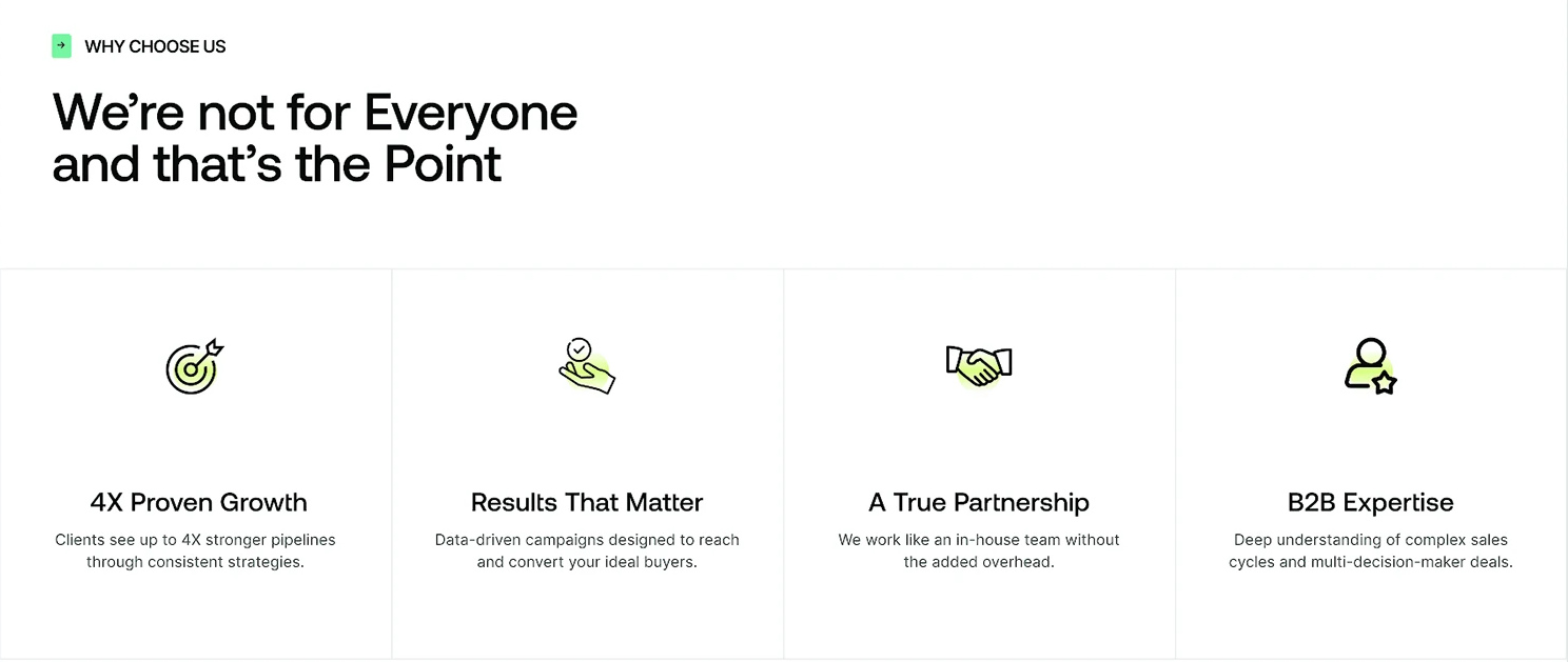
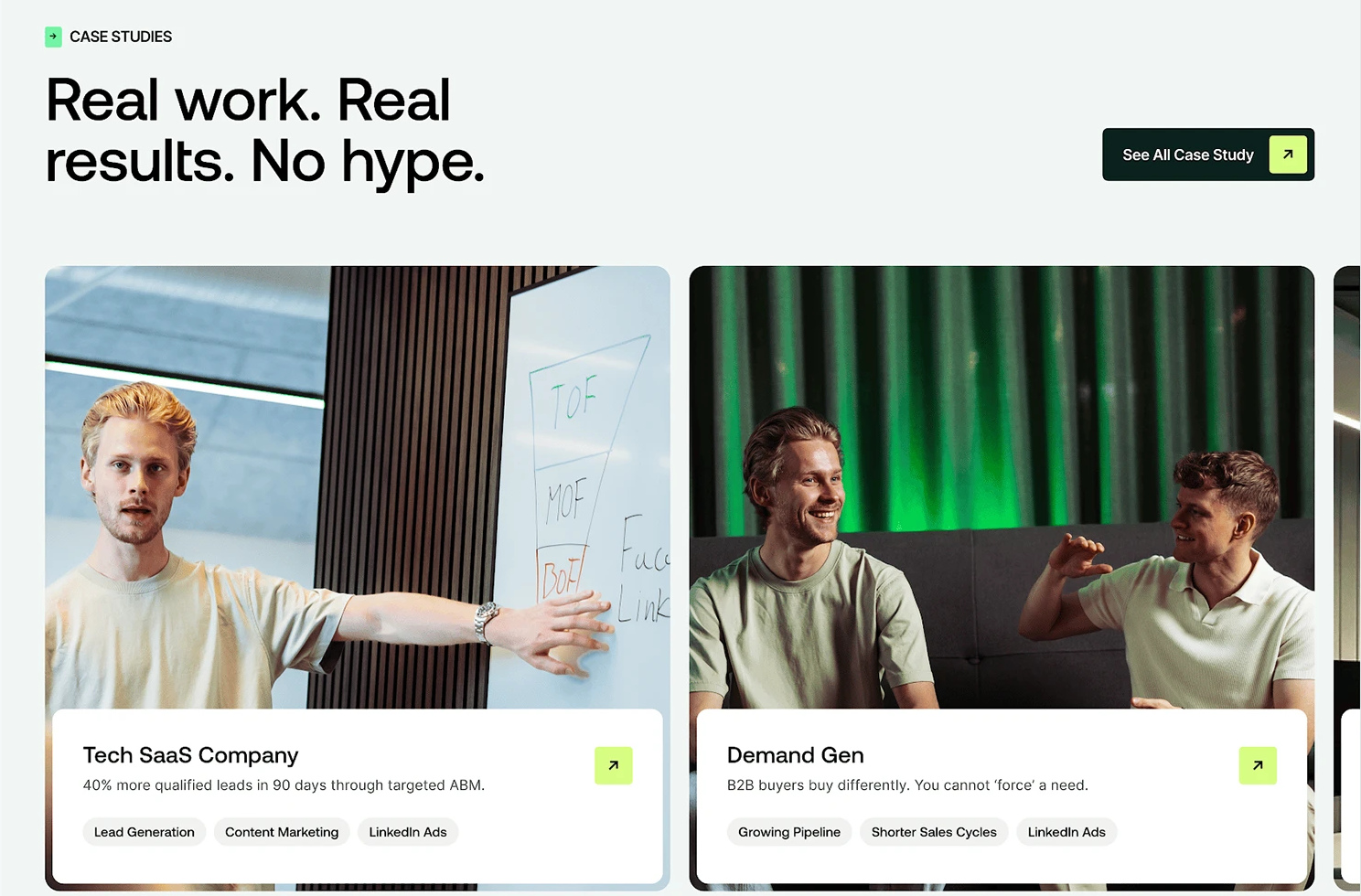
The WHY CHOOSE US screenshot leads with “We’re not for Everyone and that’s the Point”. The case-study cards place an organisation label, a result description and method tags together. One design card includes “40% more qualified leads in 90 days through targeted ABM”. Here, that wording illustrates the information hierarchy; it is not independent confirmation of the result.
A Shopify product or solution page can apply the same editorial discipline. State who the product is intended for, what has to be available before use and when another configuration is a better fit. Place those conditions near selection and purchase, rather than hiding them in a general FAQ.
For customer stories, keep the customer context, product or configuration, intervention and measured outcome connected. If the outcome has not been measured, describe the documented workflow instead of inventing a percentage. Contact forms should retain the relevant product identifier and configuration, so the buyer does not have to start the explanation again.
5. Turn the visual reference into an editable Shopify Section
The supplied implementation uses CSS Grid and Section blocks. It defines a twelve-column desktop grid, maps the available widths to six columns below 990px, and makes each card span the full twelve columns below 640px. These breakpoints belong to this example and should be checked against the theme’s actual content width.
Four block types are included: stat_card, testimonial_card, numbered_step and cta_call_card. Editors can choose a supported column span and surface theme, then enter the relevant content. A block wrapper includes block.shopify_attributes so the theme editor can identify it. These settings make the cards editable; they do not automatically connect product metafields or add an appointment integration.
Begin with a duplicated or development theme. Place the supplied Liquid file in the sections directory, then open the relevant template in the theme editor and add the new section. Before evaluating the layout, replace the sample headings and descriptions with actual content. The default values are placeholders, not verified deployment figures or genuine customer statements, and should not be published as such.
For reusable product-specific evidence, create the appropriate metafields or metaobjects and explicitly connect compatible dynamic sources or implement the data binding. A certification, test condition or quotation action should not be copied manually across unrelated products without a maintenance plan.
The three original code files are supplied in full: design tokens, label/button styles and the complete Section. They are reference code, not Volenta’s private implementation. The CTA block currently renders a link; an embedded calendar, enquiry drawer, selected-variant context and Analytics events require additional implementation.
Check the resulting page with short and long headings, missing optional content, different block counts and real images. Test keyboard focus, colour contrast and reduced-motion preferences. Verify that section CSS does not change unrelated theme components. Then follow the action as a buyer would: select the product or configuration, open the next step, and confirm that the information is still correct.
Design tokens — full original reference code
:root { /* Volenta Dark & Lime 核心色板 */ --v-bg-black: #0B0D0C; --v-surface-dark: #131A16; --v-surface-deep-green: #182920; --v-surface-mint: #DCE8E1; --v-accent-lime: #C6FF33; --v-accent-lime-hover: #D4FF66; --v-text-primary: #FFFFFF; --v-text-muted: #94A39B; --v-text-on-light: #0B0D0C; --v-border-subtle: rgba(255, 255, 255, 0.1); /* 字体与圆角规范 */ --v-font-display: 'Aeonik', -apple-system, BlinkMacSystemFont, sans-serif; --v-font-body: 'Inter', -apple-system, BlinkMacSystemFont, sans-serif; --v-radius-card: 20px; --v-radius-pill: 999px;}Labels and buttons — full original reference code
/* 方括号章节路标:[ + WHY CHOOSE US ] */.v-bracket-badge { display: inline-flex; align-items: center; gap: 6px; font-family: var(--v-font-display); font-size: 0.75rem; font-weight: 600; letter-spacing: 0.08em; text-transform: uppercase; color: var(--v-accent-lime);}.v-bracket-badge::before { content: "["; color: var(--v-text-muted); }.v-bracket-badge::after { content: "]"; color: var(--v-text-muted); }/* 电光青柠绿主按钮 + 斜箭头位移动画 */.v-btn-lime { display: inline-flex; align-items: center; gap: 8px; background-color: var(--v-accent-lime); color: var(--v-text-on-light); font-family: var(--v-font-display); font-weight: 600; font-size: 0.9375rem; padding: 12px 22px; border-radius: var(--v-radius-pill); text-decoration: none; transition: background-color 0.2s ease, transform 0.2s ease;}.v-btn-lime:hover { background-color: var(--v-accent-lime-hover); }.v-btn-lime .v-arrow { display: inline-block; transition: transform 0.2s ease; }.v-btn-lime:hover .v-arrow { transform: translate(2px, -2px); }Complete Section — full original reference code
{%- comment -%} 文件:sections/volenta-bento-proof.liquid 设计参考:Volenta | B2B Design Agency Website & Brand Identity (by SquidX Agency) 功能:在 Shopify 首页或高客单价商品页渲染暗黑风 Bento 数据证据矩阵与编号服务流{%- endcomment -%}<style> .volenta-section-{{ section.id }} { background-color: #0B0D0C; color: #FFFFFF; padding: {{ section.settings.padding_top }}px 0 {{ section.settings.padding_bottom }}px; font-family: 'Inter', -apple-system, BlinkMacSystemFont, sans-serif; } .volenta-container { max-width: 1280px; margin: 0 auto; padding: 0 24px; } .volenta-header { display: flex; flex-wrap: wrap; justify-content: space-between; align-items: flex-end; gap: 24px; margin-bottom: 48px; } .volenta-bracket-tag { display: inline-flex; align-items: center; gap: 6px; font-size: 0.75rem; font-weight: 600; letter-spacing: 0.08em; text-transform: uppercase; color: #C6FF33; margin-bottom: 14px; } .volenta-bracket-tag span { color: #94A39B; } .volenta-title { font-size: clamp(2rem, 4vw, 3.25rem); font-weight: 600; line-height: 1.08; letter-spacing: -0.02em; color: #FFFFFF; margin: 0; max-width: 680px; } .volenta-btn { display: inline-flex; align-items: center; gap: 8px; background-color: #C6FF33; color: #0B0D0C; font-weight: 600; font-size: 0.9375rem; padding: 13px 24px; border-radius: 999px; text-decoration: none; transition: background-color 0.2s ease; } .volenta-btn:hover { background-color: #D4FF66; } .volenta-btn-arrow { display: inline-block; transition: transform 0.2s ease; } .volenta-btn:hover .volenta-btn-arrow { transform: translate(2px, -2px); } /* 12 列 Bento 响应式网格 */ .volenta-bento-grid { display: grid; grid-template-columns: repeat(12, 1fr); gap: 20px; } .v-col-3 { grid-column: span 3; } .v-col-4 { grid-column: span 4; } .v-col-6 { grid-column: span 6; } .v-col-8 { grid-column: span 8; } @media screen and (max-width: 990px) { .v-col-3, .v-col-4, .v-col-6, .v-col-8 { grid-column: span 6; } } @media screen and (max-width: 640px) { .v-col-3, .v-col-4, .v-col-6, .v-col-8 { grid-column: span 12; } } /* 卡片通用样式与四套表面主题 */ .volenta-card { border-radius: 20px; padding: 28px; display: flex; flex-direction: column; justify-content: space-between; min-height: 240px; position: relative; overflow: hidden; border: 1px solid rgba(255, 255, 255, 0.08); transition: transform 0.2s ease, border-color 0.2s ease; } .volenta-card:hover { transform: translateY(-2px); border-color: rgba(198, 255, 51, 0.35); } .v-theme-dark { background-color: #131A16; color: #FFFFFF; } .v-theme-deep-green { background-color: #182920; color: #FFFFFF; } .v-theme-mint { background-color: #DCE8E1; color: #0B0D0C; border-color: transparent; } .v-theme-lime { background-color: #C6FF33; color: #0B0D0C; border-color: transparent; } /* 卡片内部元素 */ .v-pill-tag { display: inline-block; align-self: flex-start; font-size: 0.75rem; font-weight: 600; padding: 5px 12px; border-radius: 999px; background: rgba(255, 255, 255, 0.1); margin-bottom: 16px; } .v-theme-mint .v-pill-tag, .v-theme-lime .v-pill-tag { background: rgba(11, 13, 12, 0.1); color: #0B0D0C; } .v-metric-value { font-size: clamp(2.5rem, 4.5vw, 3.75rem); font-weight: 700; line-height: 1; letter-spacing: -0.03em; margin: 12px 0 8px; } .v-card-heading { font-size: 1.25rem; font-weight: 600; line-height: 1.3; margin: 0 0 8px; } .v-card-desc { font-size: 0.9375rem; line-height: 1.5; opacity: 0.82; margin: 0; } .v-step-num { font-size: 0.875rem; font-weight: 700; opacity: 0.6; margin-bottom: 24px; } .v-author-pill { display: inline-flex; align-items: center; gap: 10px; margin-top: 20px; padding: 6px 14px 6px 6px; border-radius: 999px; background: rgba(11, 13, 12, 0.08); font-size: 0.8125rem; font-weight: 600; } .v-author-dot { width: 28px; height: 28px; border-radius: 50%; background: #0B0D0C; color: #C6FF33; display: inline-flex; align-items: center; justify-content: center; font-size: 0.75rem; }</style><section class="volenta-section-{{ section.id }}"> <div class="volenta-container"> <div class="volenta-header"> <div> {%- if section.settings.bracket_label != blank -%} <div class="volenta-bracket-tag"> <span>[</span> {{ section.settings.bracket_label }} <span>]</span> </div> {%- endif -%} <h2 class="volenta-title">{{ section.settings.heading }}</h2> </div> {%- if section.settings.cta_text != blank -%} <a href="/en/{{ section.settings.cta_url | default: '/#' }}" class="volenta-btn"> {{ section.settings.cta_text }} <span class="volenta-btn-arrow" aria-hidden="true">↗</span> </a> {%- endif -%} </div> <div class="volenta-bento-grid"> {%- for block in section.blocks -%} {%- case block.type -%} {%- when 'stat_card' -%} <div class="volenta-card v-col-{{ block.settings.col_span }} v-theme-{{ block.settings.theme }}" {{ block.shopify_attributes }}> {%- if block.settings.badge != blank -%} <span class="v-pill-tag">{{ block.settings.badge }}</span> {%- endif -%} <div> <div class="v-metric-value">{{ block.settings.metric }}</div> <h3 class="v-card-heading">{{ block.settings.title }}</h3> <p class="v-card-desc">{{ block.settings.description }}</p> </div> </div> {%- when 'testimonial_card' -%} <div class="volenta-card v-col-{{ block.settings.col_span }} v-theme-{{ block.settings.theme }}" {{ block.shopify_attributes }}> <span class="v-pill-tag">{{ block.settings.badge | default: 'Verified Client' }}</span> <div> <p class="v-card-heading" style="font-size:1.125rem;">“{{ block.settings.quote }}”</p> <div class="v-author-pill"> <span class="v-author-dot">{{ block.settings.author_name | slice: 0 }}</span> <span>{{ block.settings.author_name }} · {{ block.settings.author_role }}</span> </div> </div> </div> {%- when 'numbered_step' -%} <div class="volenta-card v-col-{{ block.settings.col_span }} v-theme-{{ block.settings.theme }}" {{ block.shopify_attributes }}> <div class="v-step-num">{{ block.settings.step_number }}</div> <div> <h3 class="v-card-heading">{{ block.settings.title }}</h3> <p class="v-card-desc">{{ block.settings.description }}</p> </div> </div> {%- when 'cta_call_card' -%} <div class="volenta-card v-col-{{ block.settings.col_span }} v-theme-{{ block.settings.theme }}" {{ block.shopify_attributes }}> <span class="v-pill-tag">{{ block.settings.badge }}</span> <div> <h3 class="v-card-heading">{{ block.settings.title }}</h3> <p class="v-card-desc" style="margin-bottom: 20px;">{{ block.settings.description }}</p> <a href="/en/{{ block.settings.button_link | default: '/#' }}" class="volenta-btn"> {{ block.settings.button_label }} <span class="volenta-btn-arrow" aria-hidden="true">↗</span> </a> </div> </div> {%- endcase -%} {%- endfor -%} </div> </div></section>{% schema %}{ "name": "Volenta 暗黑 Bento 矩阵", "tag": "section", "settings": [ { "type": "text", "id": "bracket_label", "label": "方括号路标文字", "default": "→ WHY CHOOSE US" }, { "type": "text", "id": "heading", "label": "主标题", "default": "Real work. Real specs. Built for demanding teams." }, { "type": "text", "id": "cta_text", "label": "右上角主按钮文字", "default": "Book a Consultation" }, { "type": "url", "id": "cta_url", "label": "右上角主按钮链接" }, { "type": "range", "id": "padding_top", "min": 20, "max": 120, "step": 4, "unit": "px", "label": "顶部内边距", "default": 72 }, { "type": "range", "id": "padding_bottom", "min": 20, "max": 120, "step": 4, "unit": "px", "label": "底部内边距", "default": 72 } ], "blocks": [ { "type": "stat_card", "name": "数据指标卡 (Stat)", "settings": [ { "type": "select", "id": "col_span", "label": "桌面端列宽 (共12列)", "options": [ { "value": "3", "label": "3列 (1/4宽)" }, { "value": "4", "label": "4列 (1/3宽)" }, { "value": "6", "label": "6列 (1/2宽)" } ], "default": "4" }, { "type": "select", "id": "theme", "label": "卡片底色", "options": [ { "value": "dark", "label": "深炭黑 (Dark)" }, { "value": "deep-green", "label": "深森林绿 (Deep Green)" }, { "value": "mint", "label": "鼠尾草浅绿 (Mint)" }, { "value": "lime", "label": "电光青柠绿 (Lime 高亮)" } ], "default": "deep-green" }, { "type": "text", "id": "badge", "label": "顶部胶囊标签", "default": "Measured Output" }, { "type": "text", "id": "metric", "label": "核心大数字", "default": "+63%" }, { "type": "text", "id": "title", "label": "指标标题", "default": "Production Throughput Increased" }, { "type": "textarea", "id": "description", "label": "补充说明", "default": "Verified across 250+ industrial deployments in the first 90 days." } ] }, { "type": "testimonial_card", "name": "客户证言卡 (Quote)", "settings": [ { "type": "select", "id": "col_span", "label": "桌面端列宽 (共12列)", "options": [ { "value": "4", "label": "4列 (1/3宽)" }, { "value": "6", "label": "6列 (1/2宽)" } ], "default": "4" }, { "type": "select", "id": "theme", "label": "卡片底色", "options": [ { "value": "lime", "label": "电光青柠绿 (Lime 高亮)" }, { "value": "mint", "label": "鼠尾草浅绿 (Mint)" }, { "value": "dark", "label": "深炭黑 (Dark)" } ], "default": "lime" }, { "type": "text", "id": "badge", "label": "顶部标签", "default": "Enterprise Partner" }, { "type": "textarea", "id": "quote", "label": "客户评价正文", "default": "They didn't just ship hardware — they helped us fix our workflow and cut setup time by 25%." }, { "type": "text", "id": "author_name", "label": "评价人姓名", "default": "Maximilian Ashby" }, { "type": "text", "id": "author_role", "label": "职位与公司", "default": "Project Manager" } ] }, { "type": "numbered_step", "name": "编号服务/流程卡 (01-04)", "settings": [ { "type": "select", "id": "col_span", "label": "桌面端列宽 (共12列)", "options": [ { "value": "3", "label": "3列 (1/4宽)" }, { "value": "4", "label": "4列 (1/3宽)" } ], "default": "3" }, { "type": "select", "id": "theme", "label": "卡片底色", "options": [ { "value": "lime", "label": "电光青柠绿 (用于01主推项)" }, { "value": "dark", "label": "深炭黑 (用于02-04常规项)" }, { "value": "deep-green", "label": "深森林绿" } ], "default": "dark" }, { "type": "text", "id": "step_number", "label": "编号", "default": "01" }, { "type": "text", "id": "title", "label": "步骤/服务标题", "default": "Discover & Spec Audit" }, { "type": "textarea", "id": "description", "label": "步骤说明", "default": "We match power, port, and mounting specs to your exact workspace before shipping." } ] }, { "type": "cta_call_card", "name": "选型咨询行动卡 (CTA)", "settings": [ { "type": "select", "id": "col_span", "label": "桌面端列宽 (共12列)", "options": [ { "value": "4", "label": "4列 (1/3宽)" }, { "value": "6", "label": "6列 (1/2宽)" }, { "value": "8", "label": "8列 (2/3宽)" } ], "default": "4" }, { "type": "select", "id": "theme", "label": "卡片底色", "options": [ { "value": "dark", "label": "深炭黑 (Dark)" }, { "value": "deep-green", "label": "深森林绿 (Deep Green)" }, { "value": "mint", "label": "鼠尾草浅绿 (Mint)" } ], "default": "dark" }, { "type": "text", "id": "badge", "label": "顶部标签", "default": "→ STRATEGY CALL" }, { "type": "text", "id": "title", "label": "行动标题", "default": "Book an Engineering Intro Call" }, { "type": "textarea", "id": "description", "label": "说明文案", "default": "Not sure which configuration fits your fleet? Talk directly with our product engineers." }, { "type": "text", "id": "button_label", "label": "按钮文字", "default": "Schedule 15-Min Call" }, { "type": "url", "id": "button_link", "label": "按钮跳转链接 (如 Calendly 或询盘页)" } ] } ], "presets": [ { "name": "Volenta 暗黑 Bento 矩阵", "blocks": [ { "type": "stat_card", "settings": { "col_span": "4", "theme": "deep-green", "badge": "Performance", "metric": "+63%", "title": "Traffic & Output Growth" } }, { "type": "testimonial_card", "settings": { "col_span": "4", "theme": "lime" } }, { "type": "cta_call_card", "settings": { "col_span": "4", "theme": "dark" } }, { "type": "numbered_step", "settings": { "col_span": "3", "theme": "lime", "step_number": "01", "title": "01 Discover" } }, { "type": "numbered_step", "settings": { "col_span": "3", "theme": "dark", "step_number": "02", "title": "02 Strategize" } }, { "type": "numbered_step", "settings": { "col_span": "3", "theme": "dark", "step_number": "03", "title": "03 Execute" } }, { "type": "numbered_step", "settings": { "col_span": "3", "theme": "dark", "step_number": "04", "title": "04 Optimize" } } ] } ]}{% endschema %}6. Decide whether this approach fits the store
This visual language can be useful when a purchase depends on technical understanding or business confidence. It can organise equipment evidence, implementation details and a complex enquiry journey. It should not be applied solely because a dark page looks more advanced.
Three decisions matter before launch. First, use accent colour consistently rather than filling every card with it. Second, replace every metric, testimonial and certification placeholder with an evidenced statement. Third, route the visitor according to the actual buying process and product state, not an arbitrary price threshold.
The design opportunity is to connect a recognisable brand presentation with a usable purchasing or enquiry workflow. The theme structure, content model and interaction handling have to support that connection after the original designer has handed the site over.
Source: Volenta — SquidX Agency / Saber Ali on Behance. UI illustrations are attributed to the original project.
WESWOO — Shopify Storefront Development
We help Chinese brands expand internationally with storefront development and Shopify Plus integration services, supporting their cross-border commerce operations.
- Shopify storefront branding
- International UI design
- Multichannel social media marketing